John D Johnson

Gerrymandering since 2000

all1967_2012

After every census, state legislators across the country engage in the once-a-decade process of drawing themselves the most favorable seats possible. We call this gerrymandering, after a conspicuously lizard-shaped district drawn in Massachusetts in 1812. It’s a thoroughly bipartisan practice. As I show below, Democrats and Republicans alike have committed the practice with equal aplomb in recent years. But there is a solution. A handful of states have created independent redistricting commissions, which draw the boundaries of legislative districts without political pressures.

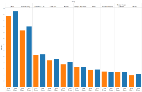
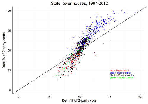
In the charts below, I plot the Democratic Party’s share of vote against their share of seats in the lower house of each state from 2000-2012.[1] To control for the effects of third parties, I calculate these figures as the Democrat’s share of just the votes cast for Democrats and Republicans; likewise, the percent of seats won is the percent of seats won by just the two major parties. Because of this, the share of seats/votes won by the Republican Party is the exact opposite of amount displayed for Democrats. If Democrats won 48% of the 2-party vote in a state, then Republicans won 52%.

demcontrol

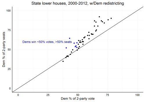
Above we see each election since 2000 in a state where Democrats had controlled the most recent redistricting. The black diagonal line indicates the equivalent division of votes and seats. Dots above the line are instances where Democrats received more seats than their share of votes. The seven blue dots represent elections where Democrats got a minority of the two-party vote but a majority of the seats.

repcontrol

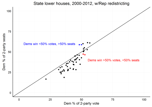
Here we see nearly the inverse of the last graph–Republican gerrymandering. In most instances, Republicans won more seats than their share of the vote.

dividedcontrol

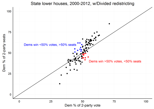
Frequently, no party controls enough of the state government to pass a redistricting bill on its own.[2] When the parties have to compromise, a more equitable distribution of votes occurs, as seen above. Notice that the pattern of dots is still steeper than the line. The more votes a party gets, the more likely it is to win a disproportionately high amount of seats, apart from gerrymandering. This is thanks to America’s first-past-the-post voting system (FPTP), which prioritizes majority building over representative parity.

indepcontrol

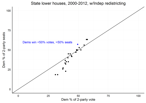
Only Alaska, Arizona, California, Idaho, Montana, and Washington use non-partisan independent redistricting commissions. Despite the limited sample size, this chart shows a much more equitable distribution of seats and votes than the gerrymandered versions above. While the partisan checks and balances of a divided government also produces a more equitable distribution, independent redistricting commissions can accomplish the same goal even when one party has control of the political apparatus.

gerrycontest

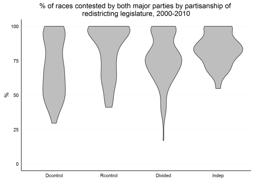
The charts above don’t fully capture gerrymandering’s negative affects. Gerrymandering doesn’t just skew seat allocation. It also discourages opposition candidates from running in districts designed to prevent them from winning. Voters, in turn, are less likely to show up if their races are uncontested. This violin plot shows the proportion of state lower house elections contested by both major parties. In some years less than 50% of races were contested in even some of the states with divided redistricting. This never occurred in a state with independent redistricting. Intentionally “safe” districts can still be drawn by legislatures with divided partisan redistricting because sitting legislators from both parties may compromise by drawing favorable seats for the status quo.


[1] Klarner, Carl; Berry, Williams; Carsey, Thomas; Jewell, Malcolm; Niemi, Richard; Powell, Lynda; Snyder, James, 2013, “State Legislative Election Returns Data, 1967-2010”, hdl:1902.1/20401, Harvard Dataverse, V1.

Klarner, Carl, 2013, “State Legislative Election Returns Data, 2011-2012”, hdl:1902.1/21549, Harvard Dataverse, V1

Klarner, Carl, 2013, “State Partisan Balance Data, 1937 – 2011”, hdl:1902.1/20403, Harvard Dataverse, V1
[2] The criteria for partisan control of the state government varies from state to state. I use Loyola Law School Professor Justin Levitt’s website AllAboutRedistricting for this information. See his page “Who Draws the Lines” for detailed information regarding individual states.

Olympic World Records

Following Olympic coverage can make it seem like new records are being set all the time. To see how true this is and (more importantly) to practice building interactive graphs, I gathered all of the 156 track and field world records listed by International Association of Athletics Federations (IAAF).

The simple scatterplot below displays the number of currently standing world records set during each year since 1977.

RecordsCount

This step chart shows the above information in a different way. I have broken out the cumulative percent of existing records set by each year for men and women. I suspected that women would have set more records than men in recent years as women’s sports grow in popularity around the world, but the data does not support this hypothesis. Click the graph and use the tooltip to view detailed information. As you can see, half of current track and field records were set before 2003.

Cumulative Percent of Records Set by Year, Gender


This final chart displays the individual record-setting events—arranged along the y-axis in no particular order. Click the graph and use the tooltip feature to view details.

Individual Titles by Year (Tooltip details)

The first chart was produced in RStudio using ggplot2. The last two charts were first built with ggplot2, with the interactive features added using plot.ly. Plotly for R is an open-source, free, and self-hosted resource, which can be used entirely offline. Check it out!

Forgottonia: Smaller, Older, Poorer

Unless you live there, you’ve probably never heard of Forgottonia. Beginning in the late 1960s, people in the 16-county region that makes up Illinois’ westernmost bulge along the Mississippi River began promoting a thoroughly tongue-in-cheek secessionist movement. Their grievance? Being forgotten by infrastructure improvement projects and business development.

Forgottonia mapLocal Western Illinois University student Neil Gamm became the governor of the new state (republic?) whose capital was the unincorporated town of Fandon. Given that the official Forgottonia flag was the white banner of surrender, Gamm described the movement’s strategy this way, “The idea is that we would secede from the Union, immediately declare war, surrender, then apply for foreign aid.”[1]

Despite this bit of local color, Forgottonia is a good stand-in for the fate of much of rural America. The secessionist movement did bring a bit of much-needed attention to the region (Amtrak reinstated passenger rail service, for instance), but for the most part Western Illinois has continued to suffer from protracted interrelated crises of demographics and economics. Farmers made up 4.6% of the labor force in 1970, but by 2010 this had fallen over half.[2] The rust belt manufacturing collapse simultaneously wreaked havoc on the region.

None of this is news to the people who live in places like Forgottonia. They recognize this reality every time they drive past another decrepit closed school or rotting farmstead. Its social consequences are clear in the empty pseudoephedrine packages that litter the ditches near amateur meth kitchens.

Here are three graphs illustrating the decline of Forgottonia. All data is from the U.S. Census Bureau and the Bureau of Labor Statistics. All dollars are inflation-adjusted to current (2016) values per the BLS official calculator.

The U.S. population grew 36.6% from 1980 to 2010. In Forgottonia, it shrank 12.1% in the same period.

Population, Labor Force, and Unemployment Rate in Forgottonia

Population Labor Force Unemployment

The yellow line shows the steady decline in the region’s population. The thicker red line shows the unemployment rate (corresponding to the right-hand axis). Unemployment topped 12% in the early 1980s—precipitating a population slide that ebbed in the 90s, but has continued more recently. We shall have to wait and see if the Great Recession-era unemployment spike, coupled with Illinois’ ongoing budget woes, contributes to another steep population slide.

Another reason for Forgottonia’s declining population is its aging population. I’ve constructed population pyramids for each census year since 1970. These are shown in the gif below. Each bar represents the percentage of the population in each age group by gender. Grey bars represent females; blue bars represent males. The steady flattening of the “pyramid” illustrates the growing age of Western Illinois.

Forgottonia Population Pyramids

PP GIF

Finally, the last graph shows Forgottonia’s median household income as compared to the U.S. median household income for the years 1969, 1979, 1989, 1999, and 2009. Unsurprisingly, Forgottonia is poorer—as much as $10,000 annually from time to time. The 1980s, once again, were particularly harsh. Perhaps most significantly, household income in 2009 is actually less than it was in 1979.

Median Household Income: 1969, 1979, 1989, 1999, 2009

Household Income

The American Dream is not working for most people in Forgottonia, and this disillusionment is reflected in the region’s politics. In the March 2016 presidential primaries avowedly anti-establishment candidates took the majority of counties. Sanders won 9 of the Democratic contests, while Trump won all but one on the GOP side.

[1] http://www.disappearingman.com/illinois/remembering-our-51st-state-forgottonia/

[2] https://www.agclassroom.org/gan/timeline/farmers_land.htm; http://www.fb.org/newsroom/fastfacts/

How Voting Systems Penalize or Encourage ‘Third Parties’

In the United Kingdom’s elections last year, the Conservative Party received 36.8% of the vote, while Labour (the next largest party) won 30.4%. However, the Conservatives got over half the seats in the House of Commons and thus the right to install their own chief executive and cabinet. Essentially, achieving less than 37% of the popular vote won them 100% of the power. Two of the more prominent minor parties—the UK Independence Party (UKIP) and the Liberal Democrats—collectively won over a fifth of the vote. Yet combined they received less than 2% of the seats in Parliament. Conversely, the Scottish National Party (SNP) turned their 4.8% of the national vote into 8.6% of the total number of seats.

Sweden held their own national parliamentary elections in 2014. The results could hardly be more different. Compare the two tables below. In each the yellow bars represent that party’s share of the popular vote, while the corresponding blue bars depict the resulting share of seats.

United Kingdom 2015 Elections[i]

Uk 2015 chart

Sweden 2014 Elections

Sweden 2014 Chart

There are two main differences between these two graphs. First, the difference between votes received and seats received for each party is much greater in the UK. Second, some parties in the UK receive more than their fair share of votes at the expense of other parties which receive less. Conversely, nearly all parties receiving seats in Sweden actually receive a slightly higher share of seats than their portion of the popular vote would suggest. The reasons for this are actually quite simple. It all comes down to the two countries’ different methods of counting votes.

The United Kingdom uses the same system as the United States. It’s called “First-Past-the-Post” (a horseracing reference). Candidates all run in districts. Whichever candidate gets the most votes in each district wins.

Sweden uses a form of proportional representation. Of the 349 seats in the Riksdag, 310 are awarded in constituency-based races—meaning that they represent specific districts of the country. However, they are not “single-member districts” as in the US and UK. Rather, each constituency has a number of associated seats ranging from 2-39, depending on its population. After these constituency-based seats have been apportioned, the remaining 39 seats are used to adjust for any deviations that may have arisen between a party’s share of the vote and its share of the seats. To enter the Riksdag, a party must have received at least 4% of the national vote or 12% in a single constituency. All those votes which went to parties failing to meet the threshold are shown in the “Other” column. This explains why most of the parties received slightly more than their expected share of seats in the parliament.

I completed the same analysis for Canada’s 2015 elections, Germany in 2013, the U.S. in 2014, Israel in 2015, and Brazil’s 2014 elections to the Chamber of Deputies (lower house). In each case I calculated a measure of the total discrepancy between the achieved and actual representation of each party. I found the difference between each seat-winning party’s portion of seats and portion of the popular vote and then added these absolute values together. The results are below.

Size of Discrepancy between Share of Vote and Share of Seats

Discrepancy table

Blue indicates FPTP voting; orange states vote proportionally; Germany uses a mixed system. As always, by clicking on the chart you can use the tooltip to see detailed results.

The graphs to the U.S. House and Senate, Israel’s Knesset, Canada’s House of Commons, and Germany’s Bundestag are below.

United States 2014

House

US House 2014 Chart

Senate

US Senate 2014 Chart

Germany 2013

Germany 2013 Chart.PNG

Canada 2015

Canada 2015 chart.PNG

Israel 2015

Israel 2015 Chart


[i] For simplicity’s sake, I’ve eliminated the following minor parties: Plaid Cymru, Democratic Unionist, Sein Fein, and the Social Democratic Labour Party. The first is Welsh and the latter three operate only in Northern Ireland. Also, I have not included the single successful independent candidate or the race of the Speaker. Traditionally, the Speaker of the House of Commons runs on an independent ticket, regardless of his previous party affiliation. If you click on the graph, you’ll be treated to a full version in all its absurd complexity.

Two Books about World War II: Endgame 1945 and A Man Called Intrepid

Stephenson, William. A Man Called Intrepid. Guilford, CT: The Lyons Press, 1976.

Stafford, David. Endgame, 1945. New York: Little, Brown, and Company. 2007.

As far as history books go, A Man Called Intrepid by William Stephenson is a bit of a popcorn read. And like movie popcorn, it’s more enjoyable when you don’t question the contents of its faux-buttery goodness. But also like popcorn at a film you’ve already seen (to completely exhaust this metaphor), the questionable ingredients become impossible to ignore about halfway through.

Intrepid tells the story of British intelligence during World War II. It structures this narrative around the life of one William “Bill” Stephenson (no relation to the author). Bill Stephenson was a Canadian who lived a truly remarkable life. As a young infantry officer in the First World War he survived a gas attack, which earned him a safe desk job. Dissatisfied with this, he finagled his way into the fledgling air force where he achieved distinction as an ace—downing 26 aircraft. He survived a crash landing, and escaped a German POW camp after three months of detainment. After the war, he became a self-made millionaire through investments in radio companies.

More importantly, Stephenson became an associate of Winston Churchill. The book follows the activities of a far-sighted clique of businessmen, intelligence analysts, and a handful of politicians who worked with Churchill during his “wilderness years” of the 1930s to monitor the Third Reich’s rise. Once the war began, this group coalesced into an intelligence and secret warfare organization under the moniker Baker Street Irregulars (referencing Sherlock Holmes’ rag-tag group of street-smart operatives). This group was headed by Stephenson who often functioned as a go-between for Churchill and Roosevelt. Once the United States entered the war, Stephenson also worked with Bill Donovan of the American Office of Strategic Services (OSS) and attempted to negotiate turf wars with J. Edgar Hoover at the FBI.

Some of the most interesting aspects of the book deal with the British intelligence community prior to Pearl Harbor. The depth of isolationist sentiment in the United States during this period is frequently under-emphasized in Ameri-centric histories. However, even the U.S. Ambassador to the UK, Joseph Kennedy (father of JFK), was wholly opposed to U.S. intervention on behalf of Great Britain. In fact, “A few days after the British declared war in September 1939, Kennedy…toasted the Germans, who ‘would badly thrash the British.’”

Even more surprising, if Intrepid’s narrative is to be believed, is the extent of Roosevelt’s clandestine involvement with a foreign intelligence operation—one which even operated in New York City offices provided by a sympathetic Nelson Rockefeller. Apparently, British agents even carried out assassinations on American soil of British sailors believed to be providing German U-boats with the coordinates of Allied convoys.

The book does acknowledge some of the difficult decisions made by Churchill and Roosevelt—namely, refusing to evacuate Coventry, bombing the Vichy French Fleet, and manipulating Hitler into viciously attacking the Balkans in order to delay Operation Barbarossa. However, Stephenson comes down firmly on the side of the Allied leaders in every instance. Much of the book feels like a polemical defense of a particular Great Man interpretation of the conflict. Leaving aside these more basic issues of historiography, other individuals involved in the British intelligence services have seriously questioned some of the factual elements of the book. In any case, A Man Called Intrepid provides a serious of amusing and intriguing anecdotes but fails to fit this into the bigger story of World War II. Even though I have a solid grounding in the war’s history, I found it difficult to connect the events of the book with the timeline of the conventional military conflict.

David Stafford’s Endgame, 1945 is about as different a history book from A Man Called Intrepid as possible. Incidentally, Stafford is the author of a much more acclaimed book on Allied intelligence, Roosevelt and Churchill: Men of Secrets, which I hope to read and review in the near future. In Endgame, however, Stafford eschews the Great Man approach and writes would could best be called a micro-history.

The book begins on April 1945 and ends with the Potsdam Conference that autumn. However, Stafford does not focus on the activities of elites during that period. Rather, he tells the stories of a handful of individuals whose experiences during the last months of the war he was able to track down through letters, journals, and interviews. The diverse cast of characters he assembled included an American infantryman and a New Zealander in Italy, a British humanitarian aid worker, a soldier from Nova Scotia, a very young British commando, a BBC correspondent who was one of the first visitors to the concentration camps, and a young German woman of aristocratic origin who was imprisoned by the SS alongside Leon Blum, Dietrich Bonhoeffer, and other elites after her father was executed for his role in the Valkyrie plot.

Adolf Hitler killed himself on April 30, 1945. In many birds eye accounts the rest of the war is just a postscript. The great achievement of Stafford’s work is his success in dispelling this perspective. For the many soldiers still slogging through northern Italy and eastern Germany, Hitler’s death did not make the bullets fly any slower or the explosions less deafening. And for the journalists and aid workers, the full horrors of the Holocaust were only just becoming apparent.

Stafford surmounts the greatest challenge of micro-histories in seamlessly weaving his disparate individual narratives into a comprehensible macro-history account of the end of the war. The reader experiences the intimate terror of a skirmish near the German border while also understanding the broader context of that particular campaign.

Endgame strips away the comfortable narrative of triumph from the end of the war in Europe. Death continued almost unabated and even hastened in some places, the Pacific Theatre loomed, and the plight of millions of starving displaced people increased in urgency as winter approached. More than anything else, the reader is left with a sense of the adrenaline and then emotional and physical exhaustion which accompanied the war’s end for those lucky enough to survive it.

How Contentiousness and Tenure have Changed in the Supreme Court

In case you haven’t heard, Supreme Court Justice Antonin Scalia died on February 13. This means there is a vacancy on the 9-member Supreme Court. According to the Constitution’s Appointments Clause President Obama will shortly nominate a successor.[1] The GOP controlled Senate will probably oppose his nominee. In all likelihood, we will have to wait until the new President and Congress takes office in January before this is all resolved.

Of the eight remaining justices on the Court, four are confirmed liberals—Ginsberg, Breyer, Kagan, and Sotomayor. Three are stalwart conservatives—Roberts, Alito, and Thomas. The final justice—Anthony Kennedy—is a Republican appointee who leans right but is more of a swing vote than anyone else. For example, he wrote the majority decision in Citizens United v. FEC, which ruled that money equals protected speech, and also Obergefell v. Hodges, which legalized same-sex marriage.

Since the Court now contains an even number of justices, we will likely experience a few tie votes. In these cases, the ruling of the lower court will remain unchanged, but it will not set a precedent for the rest of the country.

Nonetheless, there is going to be a lot of shouting between now and then. Frequently criticized is the practice of lifetime appointments for justices.[2] There is also much hand-wringing over the “increased partisanship” of the Court.[3]

Probably the most peculiar aspect of the Supreme Court is lifetime appointment. Job security for SCOTUS justices is unrivaled. They can only be removed for poor behavior. This has never happened, and only one justice has ever resigned under threat of impeachment (Abe Fortas in 1969).[4]

Because people live longer today than in 1789 when the Supreme Court came into being, many scholars have argued that we should assign justices fixed terms. Eighteen years is one popular number.[5] The idea is that justices will still be insulated from political pressure (they will still never have to think of reconfirmation), but also that decrepit old age will be avoided and fresh ideas will be more regularly interjected into the court.

In the chart below I’ve averaged the age at appointment, age at death, and length of tenure for the justices appointed in each decade since the Supreme Court began.

Line Chart - SCOTUS Trends

As you might expect, the average age of death for a Supreme Court justice has gone up significantly in the second half of the 20th century. However, the average justice is still being appointed in his or her fifties. As a result, the typical tenure of a Supreme Court justice has risen by about a decade.

Another common lament about the Supreme Court is that what should be characterized by high-minded legal consensus has (like everything else) devolved into rancorous partisanship. The next two charts show that, while there is some truth to this indictment, we shouldn’t get carried away with rosy views of past bipartisanship. Conflict over the Supreme Court is nothing new.

The first chart depicts the percent of Senators who were opposed to each nominee. (Open the map in a new page, and you can use the tooltip to see the name of each one).

Percent of Senators Opposed to SCOTUS Nominees

SCOTUS Nominees - % Opposed to Confirmation

Red dots represent candidates who were rejected by the Senate. Green dots were confirmed by the Senate. Blue dots are candidates who were confirmed by the Senate through a voice votes. Voice votes generally indicate consensus, and the number of opponents to a nominee (if any) are not recorded.

As this map shows, tightly contested votes are nothing new. The first Supreme Court nominee was rejected in 1795. However, the number of noncontroversial candidates (as indicated by voice votes) has dropped off significantly. The last voice vote took place in 1965; although, the latest nominee to receive zero “no” votes was Anthony Kennedy in 1987. Nominees since 2000 have all had a much more difficult time.

However, another way to measure changes in the contentiousness of nominees is by comparing how much time elapsed between the President’s nomination and the Senate’s vote. The process can be dragged out when less support exists for the proposed justice.

(Once again, open this chart in a new tab to use the tooltip to view the nominee name, result, and final vote tally).

Length of Nomination Period

SCOTUS Nominees - Days Nomination Active

Here the trend of increased time between nomination and confirmation is clear. Red dots represent rejected nominees. Orange dots represent nominees who were withdrawn (for whatever reason), usually without receiving a vote. Move your cursor to view the outcomes of the remaining nominations.

To conclude, nominees to the Supreme Court in recent decades have frequently encountered stiffer opposition than was normal in the past. Since 2000, no nominee has received more than 80% support among Senators. Likewise, the Senate takes much longer to vote on nominees than in the past. The average nominee since 2000 has waited about 55 days before knowing their fate. However, once seated on the bench, a justice can expect to serve as much as a decade longer than most of their predecessors.

[1] Article II, Section 2, Clause 2

[2] http://www.cato.org/publications/commentary/supreme-court-no-more-lifetime-appointments; http://www.slate.com/articles/technology/future_tense/2013/11/lifetime_appointments_don_t_make_sense_anymore.html

[3] http://www.nytimes.com/2016/02/22/us/politics/how-will-supreme-court-work-first-see-how-congress-works.html; http://www.nytimes.com/2014/05/11/upshot/the-polarized-court.html

[4] http://www.politico.com/story/2008/05/abe-fortas-resigns-from-supreme-court-may-15-1969-010346

[5] http://www.theatlantic.com/magazine/archive/2005/06/life-tenure-is-too-long-for-supreme-court-justices/304134/

4 Charts that Reveal how the Electoral College Skews Democracy

As anyone who remembers the 2000 election knows, Americans do not directly elect their President. Instead, the President is selected by the Electoral College, which consists of 538 individuals. The College isn’t a physical place, but its 538 electors are flesh and blood people. They can be almost anyone. The Constitution only stipulates, “Each State shall appoint, in such Manner as the Legislature thereof may direct, a Number of Electors, equal to the whole Number of Senators and Representatives to which the State may be entitled in the Congress: but no Senator or Representative, or Person holding an Office of Trust or Profit under the United States, shall be appointed an Elector.”

The number of electors a state receives is equivalent to its number of representatives in Congress, so a state can never have less than three electors (equivalent to one Representative and two Senators). Under the terms of the 23rd Amendment (ratified 1961), Washington D.C. also receives 3 electors.

Every state but two allots its electors on a winner-take-all system. In other words, the legislature instructs all of its electors to vote for whichever candidate wins the largest share of the vote.

Because of the winner-take-all system, it makes no difference if a candidate receives 1 vote or a million in state so long as they ultimately take less than 50% of the whole. As a result, candidates really only seriously campaign in a handful of states. Ideally, the election campaign is a time when candidates from both parties make their pitches to the broadest range of potential voters possible. The two cartograms below show just how far from reality this is.

This first map adjusts the size of US states to reflect their actual populations in 2012.[1]

Cartogram - US Population (2012)

To create the cartogram below, I tracked down every public campaign event (excluding fundraisers) held by the Obama and Romney general election campaigns during 2012.[2] The sizes of the states have been adjusted to reflect the frequency of campaign appearances in each state. I counted a total of 257 events, which took place across only 30 states. The vast majority—209—were held in only 9 states.

2012 Campaign Event Cartogram

Click on the map below to see the number of rallies held by the campaigns in each state.

Tableau event map

Finally, the limited range of possible electors for each state dramatically skews the voting power of individuals in different states. No state can have less than three electors, and the total number of electors can be no more than 538. This is why candidates occasionally win the Presidency while losing the national popular vote. Here’s how that works.

The bar chart below shows the differences in the number of citizens represented by electors from each state (click on it to interact). To see the same data in map form click here.

Tableau bar chart residents per elector

[1] All cartograms created using resources from the Robert Mundigl’s Clearly and Simply blog. Check it out!

[2] A note on data. Romney’s events were taken from the MittRomneyCentral.com calendar, beginning in late March when his campaign switched to general election mode. Obama’s events were mainly gleaned from John Wooley and Gerhard Peters’ The American Presidency Project at UC Santa Barbara. I also included official presidential trips which clearly served a campaign function beginning on January 1st.


Telepaths and Utopias! The Demolished Man (1953) and They’d Rather Be Right (1955)

For better or worse, dystopias are the name of the game in current speculative fiction. From the highly skilled (Cormac McCarthy’s The Road) to the somewhat less so (Veronica Roth’s Divergent), all manner of books, films, and television shows have had their way with the genre. Perhaps because of this contemporary fascination, our retrospective understanding of science fiction usually emphasizes older dystopian visions of the future—Brave New World, 1984, That Hideous Strength, Fahrenheit 451, and “The Minority Report,” to name just a few.

Despite our contemporary interest in the genre, not a single dystopian novel won the Hugo prize during the 1950s. In fact, the first two winners of the Hugo Best Novel prize (The Demolished Man and They’d Rather Be Right, 1953 and 1955, respectively), offer decidedly utopian visions of the future. In each work, the achievement of telepathy by a minority of the world’s population offers hope for a transcendent future in which base human flaws are overcome.

The similarities end here. Alfred Bester’s The Demolished Man tackles these ideas with mostly interesting characters, a playful plot, and compelling description. The protagonist of the story is a powerful unscrupulous business mogul named Ben Reich—not a telepath, or “esper”—who is locked in a losing struggle with a rival business titan. Reich decides the only solution is murder, but this is complicated by the fact that the police force can read your mind. What follows is a detective adventure told partly from the perspective of a kindhearted mindreading police superintendent and partly from the mind of a dangerous, desperate, but oddly sympathetic aspiring murderer. Bester manages to make the existence of literal thought police seem hopeful instead of a nightmarish. Telepaths understand what we “normals” cannot—“That there is nothing in man but love and faith, courage, and kindness, generosity and sacrifice. All else is only the barrier of your blindness. One day we’ll all be mind to mind and heart to heart.”

Mark Clifton and Frank Riley’s short novel They’d Rather Be Right offers similar expectations of the effect of telepathy, but unfortunately, brevity is the only positive aspect of this book. All of the characters are caricatures. The wooly-headed professors, idiot masses, corrupt politicians, charlatan psychologists (Scientology, anyone?), and simple-minded good souls are all saved by the world’s first telepath who invents a sentient supercomputer which can bring both immortality and transcendent telepathy to anyone who can just let go of their stultifying prior conceptions.

An unfortunate side effect of undergoing the telepathic transformation is becoming an insufferably superior ass. As one enlightened individual described it:

“To avoid the breakdowns through frustrations in my own mind, I had to modify certain concepts which were fed into me. There is the concept of infinity. There is also the concept that energy is indestructible. These two concepts do not reconcile in single-valued physics. To reconcile them, I had to come to multi-valued physics—where a fact may be irrevocably true in one context of reality, partially true in varying degrees in many, and not true at all in some.”

If 180 pages of this kind of monologue masquerading as dialogue appeals to you, you’ll love They’d Rather Be Right. You probably remember your junior high English teacher teaching you to “show not tell” in your writing. Clifton and Riley must have been sick that day.

Both books include the intriguing idea that being a telepath in a world of “normals” is profoundly isolating. We learn this in The Demolished Man from a scene where an outcast telepath named Jerry Church is found skulking outside an esper social event, desperate for the:

“multiple TP pattern of the party; a weaving, ever-changing exhilarating design.” “Outside, huddled in the shadow of the limestone arch, Jerry Church pressed against the garden door of Powell’s house, listening with all his soul. He was cold, silent, immobile, and starved. He was resentful, hating contemptuous and starved. He was an Esper 2 and starved. The bend sinister of ostracism was the source of his hunger.”

By contrast, we learn that Joe, the telepathic protagonist of They’d Rather Be Right, experiences isolation because Clifton and Riley tell us so directly, [He experienced] “the dark loneliness of lifelong solitary confinement, such as might be known by a human who was never once permitted to communicate with one of his own kind.”

The Mechanism of Change

Leaving aside the differences in style and skill, one final key dissimilarity separates these two Hugo winners. Because it is not fantasy, a work of science fiction must have some relatively believable mechanism of change, or the explanation of the difference between the book’s world and ours. In this case, the difference to be explained is telepathy.

In They’d Rather Be Right, telepathy is achieved through a proto-supercomputer built of coils and tubes named Bossy. Bossy hasn’t aged well, and the result is that the reader can never forget that the book was written over half a century ago. Compare this to Bester. In The Demolished Man, telepathy is achieved through a lengthy process of genetic manipulation—reminiscent of the practices of the Bene Gesserit in Frank Herbert’s Dune series. Given recent advances in Crispr technology and the growing debate over “designer babies” the potential for genetic manipulation of the human race seems more prescient than ever.[1]

Imagining the future of technology is a necessary part of most science fiction. But I think scifi writers aiming for timelessness will instead be better off rooting the central mechanism of change in some natural condition of humanity (be it physical bodies or human nature) than their day’s much more limited conceptions of technology.

[1] http://www.bbc.com/news/health-30742774