4 Charts that Reveal how the Electoral College Skews Democracy
As anyone who remembers the 2000 election knows, Americans do not directly elect their President. Instead, the President is selected by the Electoral College, which consists of 538 individuals. The College isn’t a physical place, but its 538 electors are flesh and blood people. They can be almost anyone. The Constitution only stipulates, “Each State shall appoint, in such Manner as the Legislature thereof may direct, a Number of Electors, equal to the whole Number of Senators and Representatives to which the State may be entitled in the Congress: but no Senator or Representative, or Person holding an Office of Trust or Profit under the United States, shall be appointed an Elector.”
The number of electors a state receives is equivalent to its number of representatives in Congress, so a state can never have less than three electors (equivalent to one Representative and two Senators). Under the terms of the 23rd Amendment (ratified 1961), Washington D.C. also receives 3 electors.
Every state but two allots its electors on a winner-take-all system. In other words, the legislature instructs all of its electors to vote for whichever candidate wins the largest share of the vote.
Because of the winner-take-all system, it makes no difference if a candidate receives 1 vote or a million in state so long as they ultimately take less than 50% of the whole. As a result, candidates really only seriously campaign in a handful of states. Ideally, the election campaign is a time when candidates from both parties make their pitches to the broadest range of potential voters possible. The two cartograms below show just how far from reality this is.
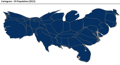
This first map adjusts the size of US states to reflect their actual populations in 2012.[1]
To create the cartogram below, I tracked down every public campaign event (excluding fundraisers) held by the Obama and Romney general election campaigns during 2012.[2] The sizes of the states have been adjusted to reflect the frequency of campaign appearances in each state. I counted a total of 257 events, which took place across only 30 states. The vast majority—209—were held in only 9 states.
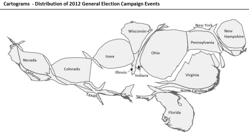
Click on the map below to see the number of rallies held by the campaigns in each state.
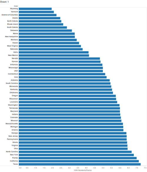
Finally, the limited range of possible electors for each state dramatically skews the voting power of individuals in different states. No state can have less than three electors, and the total number of electors can be no more than 538. This is why candidates occasionally win the Presidency while losing the national popular vote. Here’s how that works.
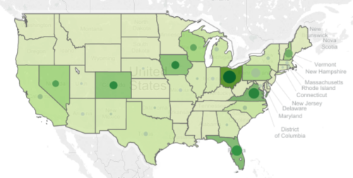
The bar chart below shows the differences in the number of citizens represented by electors from each state (click on it to interact). To see the same data in map form click here.
[1] All cartograms created using resources from the Robert Mundigl’s Clearly and Simply blog. Check it out!
[2] A note on data. Romney’s events were taken from the MittRomneyCentral.com calendar, beginning in late March when his campaign switched to general election mode. Obama’s events were mainly gleaned from John Wooley and Gerhard Peters’ The American Presidency Project at UC Santa Barbara. I also included official presidential trips which clearly served a campaign function beginning on January 1st.
